
Salman - 'Not perfect but always room for improvements, very specific to target audience and the simplistic design, and to change fonts of the regular halo'.

Moses - 'Needs to be more clear that its a cd cover, add the parental advisory explicit content image.
However I do like the regular halo fonts'.

Mustafa - 'Like how it is specific to the target audience - a new font can be considered, colour scheme correlates well with the text(good) - Could do with a splash of colour in one corner or something to stand out on shelves in a store',
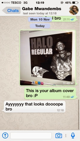
Gabriel - aka Halo. This was a response from our artist we used.

Eric 'I generally thought this was a professional cd album cover, I don't think it needs any improvements to be quite honest'. 'I was quite impressed'.
'It looks professionally and officially made'.
No comments:
Post a Comment